A.M. Cassandre

Harper's Bazaar- American Fashions, A.M. Cassandre, 1938
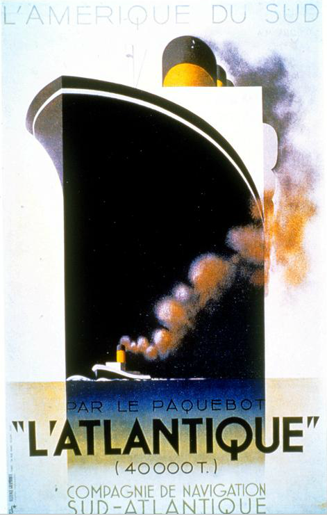
L'Atlantique, A.M. Cassandre, 1931

Pathe ( The most perfected in electrical recordings), A.M. Cassandre, 1932
Drawing from the Purist movement, A.M. Cassandre embodies Art Deco, despite an apparent influence by other movements and styles in his work. He utilized the Purists’ simplified shapes, Art Nouveau’s simple color palette, as well as past and present architecture to shape his graphics, adding to Art Deco’s minimal, geometric style. His choice of typeface was often understated and minimal but highly reflective of the subject matter. Cassandre manipulated the scale of objects in his posters to bring emphasis to the topic of the poster. For example, in the Grece travel poster (above), an arrow extends from a sailing ship down towards the abstracted word “Greece,” while a classical sculpted bust sits atop a schematic of the country. Greece, both the word in addition to the picture, as well as the bust are heavily emphasized, whereas the ship and the extensive travel by boat is minimalized to showcase the history and visual aspects of visiting Greece. Other posters by Cassandre follow a similar pattern, using more complex geometric shapes to communicate ideas and concepts practically yet aesthetically. Art Deco certainly had a creative mind in Cassandre, for he brought a twist to the movement that is admired in the present day.
Jean Carlu

Stop 'Em to Sell 'Em, Jean Carlu, 1947

The Ultimate Goal, Jean Carlu, 1958

America's Answer! Production, Jean Carlu, 1942
Jean Carlu utilized the same simplified format as his Art Deco contemporaries, but the majority of his work involved promoting government agendas. Simple, iconic images simply inform viewers of America’s social statistics, promote well being, and other various programs. In order to more identify with the middle class citizens, Carlu incorporates hands into many of his posters. His background in architecture added to his geometric configuration of shapes. The urban message in Carlu’s posters helped to revive the post-war attitude and refocus on industrial and social improvements. Using red titles for emphasis and off-white backgrounds, many of his lithography prints resemble aged classic paintings. Urban spaces could be easily filled with Carlu’s lithographs, making the printmaking method easy to reproduce downtown and adding to his value. By keeping visual ideas simple and poster text to a minimum, Carlu successfully communicates to the middle class, making his work a valuable commodity.
Cipe Pineles


Seventeen March yr 1948, Cipe Pineles, 1948

Charm July yr 1951, Cipe Pineles, 1951

Seventeen April yr 1948, Cipe Pineles, 1948
Renowned for her work in magazine cover design, Cipe Pineles used her personal vision to catapult her crisp and clean style. Much of her style stems from a simple, elegant serif typeface and a crisp, stylish picture of a woman. The March 1948 issue of Seventeen magazine depicts a glamorous female surrounded solely by the Seventeen title. Leaving the article topics off of the cover is exemplary of Pineles’ dedication to minimalism and Art Deco. Reducing the cover to a simple image adds the appearance of a higher end magazine, and important skill that Pineles applied when working for Vogue and Vanity Fair. Charm magazine also hired Pineles to design their July 1951 cover in which similar elements are employed to bring Charm to a level of sophistication. A few headlines are posted around the cover model’s face, but the text is subtle and non distracting; all the pieces work cohesively, a fundemental point of Art Deco. Pineles adds a timeless sheen to fashion magazine covers that many modern designers aim to replicate.
No comments:
Post a Comment