Monday, December 5, 2011

International Style Blog Post

Josef Muller-Brockmann

Musica Viva Radial, Josef Muller-Brockmann, 1970

Color Sticks, Josef Muller-Brockmann, 1960

Grammo-grafik, Josef Muller-Brockmann, 1957


Muller-Brockmann’s colorfully minimalist style typically involves multiple colors and simple shapes for the musical community. Between Musica Viva Radial and Color Sticks, the entire rainbow spectrum was represented in seemingly the same color palette. Soft yet spritely colors bring a vibrance to an apparently bland musical community. Grammo-graifx is a more melodramatic poster considering the two previously discussed, however it should be noted that the poster donning the record front and center was one of Muller- Brockmann’s first posters made before his experimentation with wild hues. The Bauhaus school influenced the shift from plain to snappy. The addition of color to his posters added a rhythm to his design style that reflects the rhythm of the music. Since he was multilingual, he was able to design posters for at least four different cultures. Using mathematical approaches to achieve symmetry and correct forms.


Alvin Lustig
Fortune, September, 1952, Alvin Lustig, 1952

New Classics Announcement, Alvin Lustig, 1943-45

Alvin Lustig christmas card, Alvin Lustig, 1938-42

After a career in book cover illustration, Fortune magazine snapped up Alvin Lustig’s talents in cover designs. Vivid color palettes and wild, angular shapes created a fanciful landscape of pictures different than any other designer of the time.The September 1952 has a collage feel with the mixed-matched text and the painterly quality of the pink and orange background. Placing the titles of the articles in the black and white building shapes was an original way to display the Fortune’s content. Gathering his diverse style from Dadaism and Art Deco, Lustig creates a mix of simple and whimsical images in his designs. Lustig takes complex shapes to a peak with his Christmas Card. Blue and red squiggles, stripes, stars, and dots dance in a snowy, framed setting. The perfect match of opposites creates a colorful visual harmony that becomes important when marketing a magazine. Lustig is in tune with the balances between sharp and soft objects in order to create a certain harmony.


Saul Bass
One, Two, Three, Saul Bass, 1961

Anatomy of a Murder, Saul Bass, 1959

Bonjour Tristesse, Saul Bass, 1957

Focusing on communicating through abstract geometric figures, Saul Bass creates slightly uneasy yet identifiable concepts in his movie poster designs. Though at first glance the subject may seem cryptic, after watching the movie the shapes reveal the meaning behind the oddly placed squares and dislocated body parts. In Bass’ Anatomy of a Murder, Bass plays up the idea of dissection and chalk outlines with a delineated figure playfully laying on the floor, doll-like. The affect of demarcating is further realized in the text, which is also outlined to create a form instead of just words. One, Two, Three is pictorially drawn counting the number of balloon cutouts the female figure holds. In each of his posters, his use of black emphasizes the most important aspects of the movie. The woman’s glove, the outline of the body, and the face’s tear are all black to signify importance. Saul Bass’ style is inspirational for the modern designer, as it’s shape and form create enigmatic movie posters representational of a generation craving mystery.

Art Deco Blog Post

A.M. Cassandre

Harper's Bazaar- American Fashions, A.M. Cassandre, 1938

L'Atlantique, A.M. Cassandre, 1931

Pathe ( The most perfected in electrical recordings), A.M. Cassandre, 1932

Drawing from the Purist movement, A.M. Cassandre embodies Art Deco, despite an apparent influence by other movements and styles in his work. He utilized the Purists’ simplified shapes, Art Nouveau’s simple color palette, as well as past and present architecture to shape his graphics, adding to Art Deco’s minimal, geometric style. His choice of typeface was often understated and minimal but highly reflective of the subject matter. Cassandre manipulated the scale of objects in his posters to bring emphasis to the topic of the poster. For example, in the Grece travel poster (above), an arrow extends from a sailing ship down towards the abstracted word “Greece,” while a classical sculpted bust sits atop a schematic of the country. Greece, both the word in addition to the picture, as well as the bust are heavily emphasized, whereas the ship and the extensive travel by boat is minimalized to showcase the history and visual aspects of visiting Greece. Other posters by Cassandre follow a similar pattern, using more complex geometric shapes to communicate ideas and concepts practically yet aesthetically. Art Deco certainly had a creative mind in Cassandre, for he brought a twist to the movement that is admired in the present day.


Jean Carlu

Stop 'Em to Sell 'Em, Jean Carlu, 1947

The Ultimate Goal, Jean Carlu, 1958

America's Answer! Production, Jean Carlu, 1942

Jean Carlu utilized the same simplified format as his Art Deco contemporaries, but the majority of his work involved promoting government agendas. Simple, iconic images simply inform viewers of America’s social statistics, promote well being, and other various programs. In order to more identify with the middle class citizens, Carlu incorporates hands into many of his posters. His background in architecture added to his geometric configuration of shapes. The urban message in Carlu’s posters helped to revive the post-war attitude and refocus on industrial and social improvements. Using red titles for emphasis and off-white backgrounds, many of his lithography prints resemble aged classic paintings. Urban spaces could be easily filled with Carlu’s lithographs, making the printmaking method easy to reproduce downtown and adding to his value. By keeping visual ideas simple and poster text to a minimum, Carlu successfully communicates to the middle class, making his work a valuable commodity.


Cipe Pineles

Seventeen March yr 1948, Cipe Pineles, 1948

Charm July yr 1951, Cipe Pineles, 1951

Seventeen April yr 1948, Cipe Pineles, 1948


Renowned for her work in  magazine cover design, Cipe Pineles used her personal vision to catapult her crisp and clean style. Much of her style stems from a simple, elegant serif typeface and a crisp, stylish picture of a woman. The March 1948 issue of Seventeen magazine depicts a glamorous female surrounded solely by the Seventeen title. Leaving the article topics off of the cover is exemplary of Pineles’ dedication to minimalism and Art Deco. Reducing the cover to a simple image adds the appearance of a higher end magazine, and important skill that Pineles applied when working for Vogue and Vanity Fair. Charm magazine also hired Pineles to design their July 1951 cover in which similar elements are employed to bring Charm to a level of sophistication. A few headlines are posted around the cover model’s face, but the text is subtle and non distracting; all the pieces work cohesively, a fundemental point of Art Deco. Pineles adds a timeless sheen to fashion magazine covers that many modern designers aim to replicate.


Wednesday, November 30, 2011

Final: Information Design

Members:

Holley Aaron
Bailey Webb
Haley Hagle
Sarah Erdwins


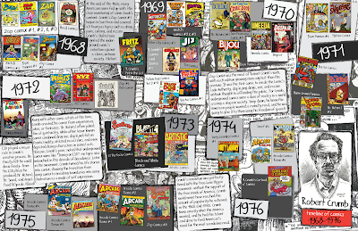
For our topic we chose the Underground Comix movement. Our posters include: Robert Crumb's timeline of comix, the Underground Comix in the United States, and the levels of explicit content in the Underground Comix. Robert Crumb was instrumental in the development of Underground Comix, so covering his works over the height of the movement seemed crucial to the informational map. The underground comix movement mainly occured in the United States, so the poster only covers the major areas where the comics were popular. The explicit content poster discusses the levels of raunchiness found in the various comics. To unify the group project we kept the same color palette and comic book fonts.


Works Cited

Ahrens, Lois, et al. The Real Cost of Prisons Comix. Oakland, CA: PM Press, 2008. Print.
Carlin, John. "The Real Comic Book Heroes." Tate Etc. Spring 2007: 60-9. Art Full Text. Web. 28 Nov. 2011.
Carlsson, Chris, et al. “The Rise and Fall of the Underground Comix Movement in San Francisco and Beyound.” Ten Years That Shook the City: San Francisco 1968-1978. Ed. Jay Kinney. San Francisco, CA: City Lights Books, 2011. 272-275. Print.
Estren, Mark J. A History of Underground Comics. Berkeley, CA: Ronin Pub., 1993. Print.
Hatfield, Charles. Alternative Comics: an Emerging Literature. Jackson, MS: University of Mississippi, 2006. Print.
Heller, Steven. "Here at Zap Comix." Print (New York, N.Y.) 54.3 (2000): 100-5. Art Full Text. Web. 28 Nov. 2011.
Lopes, Paul. Demanding Respect: the Evolution of the American Comic Book. Philadelphia Pa: Temple Univ., 2009. Print.
McCleary, John Bassett. Hippipe Dictionary. A Cultural Encyclopedia of the 1960s and 1970s.Berkeley, California: Ten Speed Press. 2004. Print.
RosenKranz, Patrick. Revel Visions, The Underground Comix Revolution 1963 – 1975. Seattle: Fantagraphics Books. 2002. Print.
Sorensen, Lita. Bryan Talbot. New York, NY: The Rosen Publishing Group, 2008. Print.
Wiater, Stanley and Stephen R. Bissette. Comic Book Rebels. Conversations with the Creators of the New Comics. New York: Donald I. Fine, INC. 1993. Print.
Wood, Alexander. "Early Family Life." R. Crumb's Biography. Web. 28 Nov 2011.

Monday, November 28, 2011

Crumb Timeline Final

Heller, Steven. "Here at Zap Comix." Print (New York, N.Y.) 54.3 (2000): 100-5. Art Full Text. Web. 28 Nov. 2011.
Carlin, John. "The Real Comic Book Heroes." Tate Etc. Spring 2007: 60-9. Art Full Text. Web. 28 Nov. 2011.
Wood, Alexander. "Early Family Life." R. Crumb's Biography. Web. 28 Nov 2011. 

Thursday, November 24, 2011

Final Blog Post: movements by image

Arts & Crafts
Josef Hoffmann, Werkbund, 1914
http://www.edition20.com/en/products/Kunstschau-Werkbund-by-WOKA-by-Josef-Hoffmann

William Morris, wallpaper featuring acanthus leaves, 1875
http://www.britannica.com/bps/media-view/94652/1/0/0


Koloman Moser, Venus in the Grotto, 1915
http://www.wooop.com/poster-canvasartprint/b/paintings-koloman-moser/artwork/4406.html


Art Nouveau


Jules Cheret, L’Hippodrome 4 clowns, 1882
Leonetto CappielloLivorno stagione balneare, 1901
William Bradley, Christmas Poster, 1985


Sachplakat

Lucien Bernhard, Osram Lightbulbs, 1920


Julius Klinger, Hermanns & Froitzheim, 1910


 Hans Rudi Erdt, Kauft Scherl Bucher1915-16


Art Deco


Monsavon Soap by Jean Carlu


A.M. Cassandre, Pivolo Aperitif


Jean Carlu, Give 'em Both Barrels, 1941

De Stijl
Theo van Doesburg, Girl with Buttercups, 1914
Gerrit Rietveld, Red and blue arm chair 1918


Theo van Doesburg,Counter composition VI, 1925


Constructivism
Beat the Whites with the Red Wedge, El Lissitzky, 1919

Dobrolet poster, Alexander Redchenko, 1923

Watches, Alexander Rodchenko, 1923


Bauhaus
Laszlo Moholy-Nagy, Bauhaus Balconies, 1926

Laszlo Moholy-Nagy, Composition X VIII, 1924

Lot Nr. 214, Fritz Schleifer, 1923


International Style
General Dynamics, Erik Nitsche, 1959

Josef Müller-Brockmann, Auto Club of Switzerland Poster, 1955

History of Physics, Erik Nitsche, 1963


Psychedelic Poster Art


Moby Grape, The Sparrow, Charlatans, Alton Kelley, 1966-67

The Wildflower, Victor Moscoso, 1967

Jefferson Airplane, Grateful Dead, Wes Wilson, 1966


Postmodernism
Dylan, Milton Glaser, 1966

Mahalia Jackson, Milton Glaser, 1967

Orbit bar wrapper, Tibor Kalman, 1999

Gig Poster


Band of Horses Concert Poster, Guy Burwell, 2008

Blitzen Trapper, Hero Design Studio and Boutique 2009

Grizzly Bear, Hero Design Studio and Boutique 2009