3 Designers:
Saul Bass
Page 317
Saul Bass is renowned for his work in movie posters. His geometric style is simplistic yet memorable. Even with a quick glance at his work, so much information can be acquired through his strategic use of images.
Exodus, Saul Bass, 1961
In Harm's Way, Saul Bass, 1965
Vertigo, Saul Bass, 1958
Paul Rand
page 328
Paul Rand used his creative abilities to redefine how the public viewed Corporate America’s various logos. Using cutting edge and sometimes unaccepted typefaces and symbols, Rand’s freelance career inspired the postmodern, typeface centered, simplistic logo style.
UPS logo, Paul Rand, 1961
http://www.paul-rand.com/assets/gallery/identity/logo_ups_large.jpg
Enron logo, Paul Rand, 1996
http://www.areaofdesign.com/americanicons/rand/enron.jpg
IBM, Paul Rand, 1972
http://breezycreativedesign.com/2010/04/02/paul-rands-wip/
Neville Brody
page 360
Well known for his magazine design in Europe, Neville Brody is one of the few designers who focuses much of his composition on the making the type the main shapes in his designs. Viewing his work absorbs much of the cerebral, as his work is often hard to decipher. Though visually confusing at times, much of the color vibes create a subconscious understanding of what the viewer is supposed to gather from the magazine page.
Neville Brody, 2009
http://static.dezeen.com/uploads/2009/10/dzn_Neville-Brody-art-directs-Arena-Homme-2.jpg
Neville Brody, 1980s
https://blogger.googleusercontent.com/img/b/R29vZ2xl/AVvXsEjl9SXzc_RkAZjlJhaoK5nrB3gp1PTK01Iao3ppvHe-dvBSQE-vB2B1jRXVgrVLlEmZcMtDYlCTcqFXnshuAbeLPyHMoKBped4b-1_GyYIPizs0a6QGwTlpJpnsvI-3lfurKbJ37ko6rHA/s1600/facep24-25.jpg
Neville Brody, 1992
Art Nouveau: production designer perspective
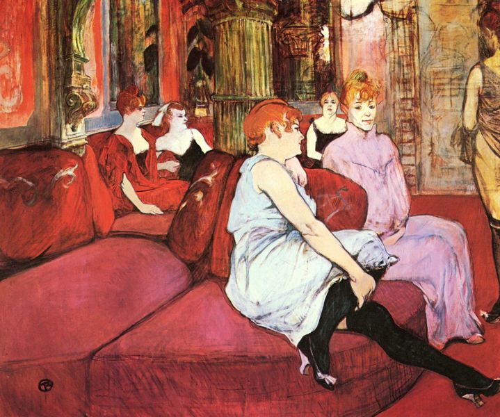
As far as aesthetics are concerned, Carroll Moore’s documentary is highly informative of Toulouse-Lautrec’s life, yet the cinematography falls short of representing Toulouse-Lautrec in a stylistic manner. Moore’s factually saturated documentary was nicely complimented by Catherine Martin’s production design in Moulin Rouge, which portrayed Toulouse-Lautrec as he lived through his posters. Both films are equally informative, but in different ways. Moulin Rouge sets the viewer in the time period; the viewer subconsciously learns about the lifestyle of Montmartre. Conversely, Moore’s film shows clips and pictures from Montmartre, but since the media is dated the experience of the film is nostalgic rather than engaging. Martin used the attire of the subjects of Toulouse-Lautrec’s posters, as well as the pure insanity depicted in bar scenes of Lautrec’s art. One mantra of the main characters is “freedom, beauty, truth, and love” which are the main concepts of Toulouse-Lautrec’s depictions of Montmartre. Dancing, singing, raw expressions, and romance in Toulouse-Lautrec’s art are qualities that keep the posters identifiable in the contemporary era. Moore’s Montmartre versus Martin’s is really not as different in reality as it is different in the style of presentation. As stated earlier, Martin actively invites the viewer in, whereas Moore displays information and leaves the experience to the viewer’s imagination. Toulouse-Lautrec’s paintings are rawer, with more painterly expressions than his posters, which are typically consisted of thick, sharp edges and color fields.

http://www.ibiblio.org/wm/paint/auth/toulouse-lautrec/i/goulue-litho.jpg
http://juliedemboski.files.wordpress.com/2011/08/henri_de_toulouse-lautrec_012.jpg
I feel the poster and the painting by Toulouse-Lautrec depicts the underlying mood of Moulin Rouge. Underneath the manic parties there is the brokenness and shallowness of the absurd lifestyle. In the poster, the shady character gazes at the colorful can-can dancer. Also, in the painting, call girls sit around waiting for the highest bidder to collect their bodies as their prize. In either picture, the eclectic vibe of Montmartre is overshadowed by the reality of the era.


